
SELECT AN ITEM
ART DIRECTION
GRAPHIC DESIGN
KINETIC IDENTITIES
WEB DESIGN
3D
GRAPHIC DESIGN
KINETIC IDENTITIES
WEB DESIGN
3D
I’m Zack, a multidisciplinary visual designer based in Brooklyn, New York. With a background in brand design, my work focuses on speaking a wide range of visual languages in order to tailor my output to distinct audiences.
My clients range from Fortune 500 companies to indipendent startups across tech, media, fashion & consumer goods but my goals remain the same regardless of size: to connect people together in a way that is authentic & beneficial for everyone involved.
ZACK CHAN

DISCIPLINES
Top Work Places
PRESENTED BY
PRESENTED BY THE WASHINGTON POST

● Celebrating the top employers of the greater DMV area


●
Previous winners become the next year's identity so that every year feels fresh but familiar
Previous winners become the next year's identity so that every year feels fresh but familiar


DISCIPLINES
NEW
YORK'S
FINEST
TRASH
YORK'S
FINEST
TRASH
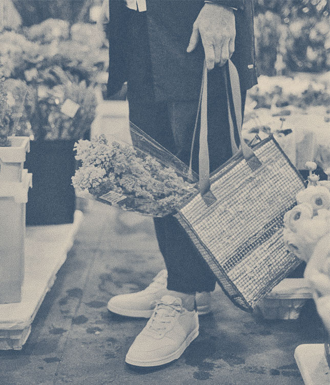


Where most brands that claim NYC as an aesthetic try to hide the dirtier side of the city to create the romantic fantasy we see in the movies, we decided to do the opposite. Since the product is literal trash, we decided to double down on grit and grunge to give an honest view of NYC. We dug in to the city's storied history of hip hop, skate, graf & disco culture for inspiration.


While doing my research for this project, I came across a study published by National Geographic showing what the world would look like if all of the ice were to melt. I was stunned by the entirety of Florida along with the whole eastern seaboard under water. We’d lose most of California too, turning the Sierras into a peninsula. And that’s just looking at North America.
As alarming as it may be, we thought the image was so important that we made it our call to arms. The map used in the icon is our future if left unchecked.
As alarming as it may be, we thought the image was so important that we made it our call to arms. The map used in the icon is our future if left unchecked.
After the relaunch of the brand, Alex went from selling 35 bags a year to 1,500 bags in 2022.

DISCIPLINES
THE WASHINGTON
POST ALL-HANDS
POST ALL-HANDS
JAN 31
- FEB 1
- FEB 1
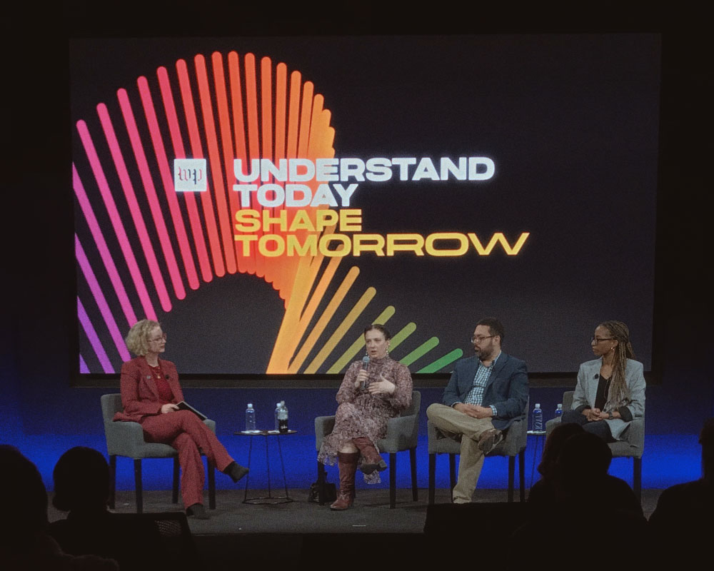
Understand today,
shape tomorrow
shape tomorrow

CONFLUENCE

Every February/March, The Post’s Creative Group gathers in DC to align on goals for the coming year. These events, while internal, get the full treatment of the WP Live and Brand Identity teams. Multi-day itinerary, guest speakers, catering, even a post-event gathering. As part of the Branding & Identity team, it was my job to come up with the design system to be used across every touchpoint.
Consisting of over 200 talented individuals, the color bar motif came to represent the WP Creative Group's vast array of individuals and specializations coming in to sync for a unified goal.
Using our brand palette and typography, I made a flexible animation system that could adapt to various touchpoints. The rainbow of color and constant motion serve to suggest forward momentum & optimism while the minimal nature of the surrounding aesthetics keeps an overall sophisticated tone.

DISCIPLINES


DISCIPLINES

Updates in
real-time.
real-time.
OVERVIEW
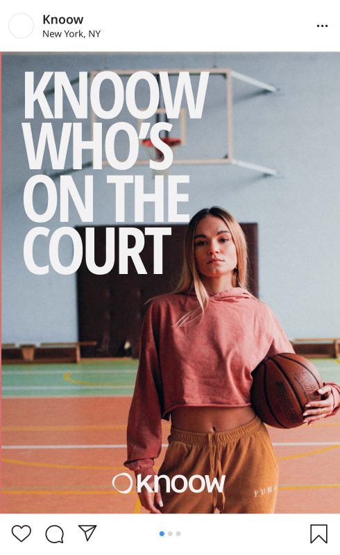
Visual identity development for the Knoow App & Brand.
TOOLS USED
Blender 3D
Figma
Illustrator
Photoshop
Knoow asked me to help them develop the new identity for their platform.
Sitting somewhere between Twitter and Uber, Knoow offers a way for people to share real-time, targeted, location-based information in exchange for a small fee.
You can get some cash just for being outside. Or you can save yourself a trip if the place you want to go is slammed.
Pretty nice.
Pretty nice.

It pays to Knoow


The ring's undulating outer edge represents an area of influence that is in constant flux as you move through the world.
The inner ring plays on the idea of you inner circle. Your connection to the world around you doesn't need to be bound to your personal contact list. Your circle
The inner ring plays on the idea of you inner circle. Your connection to the world around you doesn't need to be bound to your personal contact list. Your circle
Social content that's
both lifestyle inspiration
and local recs
both lifestyle inspiration
and local recs


Iridescent blue palette
with soft black and gray base
feels calm but powerful
with soft black and gray base
feels calm but powerful

Bold but minimal type
provides character while
maintaining legibility
provides character while
maintaining legibility

DISCIPLINES

SEBREE


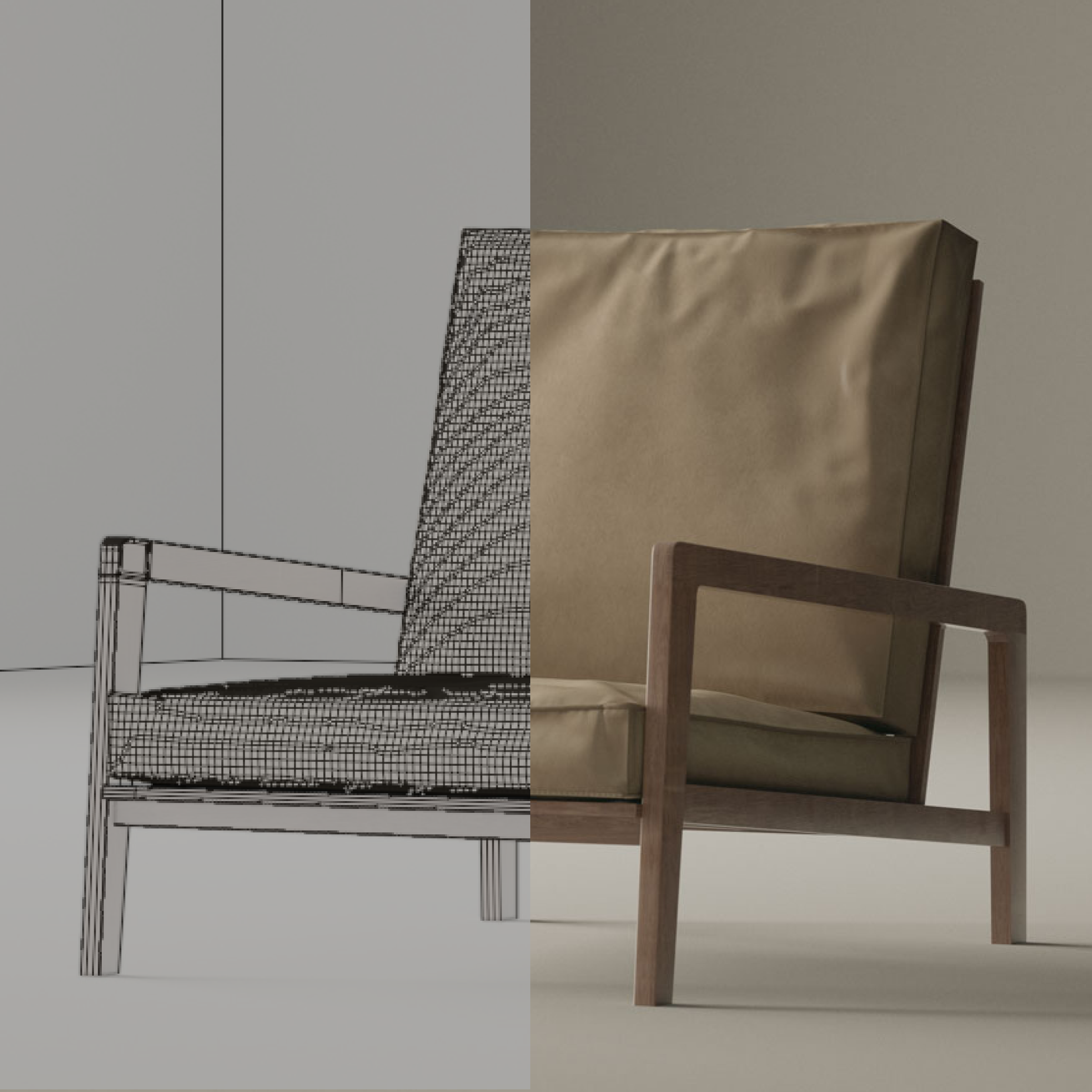
The model is a near 1:1 recreation of the real piece.Utilizing Swiss design language, the result is a juxtaposition of old and new, physical and digital.

DISCIPLINES

OVERVIEW
This project is based on the furniture designs of designer Kylle Sebree. I worked with Kylle in his shop during the pandemic, learning a great deal about fine woodworking and what goes in to designing remarkable furniture. I used what I learned during that time to inform the process for this project. I recreated one of Kylle's pieces, the Thompson Lounge Chair, as an exploration in 3D workflows.
TOOLS USED
Blender 3D
Substance Painter
Octane Render
Photoshop


This is some text inside of a div block.


DISCIPLINES
OVERVIEW
Back in the throws of quarantine, Deus Ex Machina hosted a design competition with the intent to invigorate and foster connections with the design community around the world.
My approach was to create something that the brand wouldn’t typically release instead of going for something that is expected from the brand. At the time, I was intrigued by 90s rave graphics so I decided to reimagine their brand within the context of that niche style. And it paid off; out of over 3,000 participants, I was 1 of 10 selected to have a run of shirts made for the store.
My approach was to create something that the brand wouldn’t typically release instead of going for something that is expected from the brand. At the time, I was intrigued by 90s rave graphics so I decided to reimagine their brand within the context of that niche style. And it paid off; out of over 3,000 participants, I was 1 of 10 selected to have a run of shirts made for the store.
TOOLS USED
Illustrator
Photoshop
DISCIPLINES
.gif)

DISCIPLINES
.png)
.jpg)
.png)
.png)
These layers are grabbable.
Move them around to see how
they affect each other.
Move them around to see how
they affect each other.
DISCIPLINES


DISCIPLINES
OVERVIEW
This project is based on the furniture designs of designer Kylle Sebree. I worked with Kylle in his shop during the pandemic, learning a great deal about fine woodworking and what goes in to designing remarkable furniture. I used what I learned during that time to inform the process for this project. I recreated one of Kylle's pieces, the Thompson Lounge Chair, as an exploration in 3D workflows.
TOOLS USED
Blender 3D
Substance Painter
Marvelous Designer
Octane Render
Photoshop
The model is a near 1:1 recreation of the real piece.
Utilizing Swiss design language, the result is a juxtaposition of old and new, physical and digital.
Utilizing Swiss design language, the result is a juxtaposition of old and new, physical and digital.

These layers are grabbable.
Move them around to see how
they affect each other.
Move them around to see how
they affect each other.


.png)